Choosing a color scheme for your home is a difficult and time consuming process. Not only do you have to consider the style, texture, and mood of a single room, you also have to design it in such a way that it coordinates with the rest of the home. At Annadel Builders Inc., our California custom home builders have discovered some tips for establishing a color scheme that is seamless, timeless, and refreshing. Begin painting your home by first considering all the factors that contribute to a consistent and excellent decorating scheme.
- Note which rooms are visible to one another. Walk through your house, noting which spaces can be seen from each room. Use a rough sketch of the floor plan to keep track of your home’s color scheme. The last thing you want is to realize that two adjoining rooms have clashing color schemes after the fact.
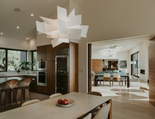
- Pick a color for the biggest, most central room of your house. Most likely your kitchen or living room, this space will provide the foundation for your whole-house palette. If you’re struggling to pick a color, opt for a softer, neutral hue that will work well with a wide variety of color schemes. This will make choosing colors for other rooms easier. Alternatively, if you plan on painting a certain room with a bold color, start there and build out. Although it can be pulled off, try to avoid painting adjacent rooms in bold, contrasting colors. Instead, choose softer, more subdued tones for a room next to bold colors.
- Build your palette with shades of the same hue. After picking the color for your first room, one option is to simply choose different shades of the same hue for nearby rooms or walls. Try taking your original color and either choosing a shade up or down on the color wheel, or even going to the paint store and adding a small amount of white paint to make a slightly lighter version. This method will ensure that your home has interest and depth while keeping its color scheme seamless.
- Keep connecting spaces neutral. Again, while not a hard and fast rule, choosing colors such as white, beige, and grey for halls and landings gives a visual respite between more brightly themed rooms. However, if your rooms are more neutral, hallways and landings can be a good space to experiment with more complex hues. Just make sure to maintain variety as well as visual respites from bold colors or patterns.
- Decorate from dark to light vertically. A trick to improve the feel of any room, decorating dark to light from the ground up mimics what we see in nature—dark earth, medium trees and horizon line, light sky. Additionally, it draws the eye upwards and creates the feel of a taller space. Choose a palette for the room and pick rugs and floor coverings from the darkest end of the spectrum, dressers, bedding, and furniture from mid-spectrum, and the roof and ceiling fixtures from the lightest. Your rooms will feel more open, relaxing, and natural as a result.